Wednesday 22 February 2012

The architecture's design

Half Dose : BIGNYC
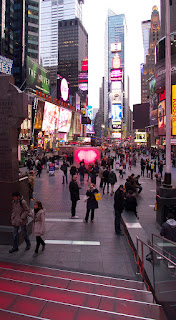
 For the fourth year in a row the Times Square Alliance has commissioned an architect to create a heart in Times Square just in time for Valentine's Day. This year's installation is by Bjarke Ingels Group(BIG) with FLATCUT_and Local Projects and it is appropriately titled BIG NYC. As the placard next to it, visible in the photo above, describes it:

More people = more love. A BIG red heart pulses with glowing light in a grove of glass rods. A
single person can activate the beating heart, but joining hands with others will make the heart
beat even faster to create a brightly burning heart.


These 400 acrylic tubes -- a 20 by 20 grid -- create a 10-foot-tall cube that recedes or holds its own in the Times Square environ. The installation alters between these impressions depending on the glow of the LEDs in the center of the cube: Between "beats" the tubes almost disappear, but when glowing the heart shape is well-defined and it pulls one towards it. The above view is from a block sourth of Father Duffy Square, where the heart resides just south of the TKTS booth and steps.
 The photos above and below are taken from the TKTS steps. These views are particularly interesting because they give a slight glimpse of the tops of the 400 tubes. Also, from the steps the immediate background for the heart is the crowd of people passing around it.
Just south of the installation is its interactive component, called out simply with a heart on a podium, the words "touch me," and some visual directions on how to make the installation beat faster. Upon touching the pad, the LEDs glow in a pulsating rhythm that speeds up when people hold hands or, supposedly, when they kiss. It's a neat idea, to link the intimacy of Valentine's Day with the impersonal crowdedness of Times Square and New York City. This occurs not only in the interactive part, but also in the way the heart -- physically something that each individual has -- is figuratively created by the density of rods.
.
While the three previous installations created hearts from matter -- metal, ice, fabric -- this one opts for immaterial light and the convergence of the color red in a mass of otherwise undifferentiated clear rods. In name BIG♥NYC may be as much promo for Mr. Ingels as it is a Valentine's display for New York City, but its qualities are undeniable and it is a welcome addition to the Times Square for its brief duration (until the end of the month).

Saturday 11 February 2012

Typography

Oh yeah, I found out something interesting as what i had mentioned last blog...haha.
It's a fun topic and i quite interested on, I found a web that giving me a very nice sentence, which is
http://www.wpdfd.com/issues/23/typography/

"Good typography is just as important on a Web page as it is in any other medium. The fact that it appears on a computer screen and not on a piece of paper is immaterial; it should still be pleasing to look at and easy to read."

From here, i started to do some more research about typo, and it's not tat simple to make someone feel comfortable with the color sense and the composition. Every tiny mistaken will given a big outlook to the audience. Although most of the audience didn't know about typography at all, but they can still having a sense to conclude it's nice or bad...

Other than composition, emphasis, de-emphasis, relativity and type, size, weight and many more are very priority to make a perfect typography.

I had a typography class in semester 1, and I learned many thing in there. before i learned, I would like to play sometime very 'decorative' which many people thought it's nice! Conclusion, it's totally not what a typography. And I changed to be making something simple and perfect.(still in beginner process only, hehe)

However, A complicated background of any poster or whatever design, there must be a simple font for it, or else no focus point and very dirty outlook for the overall. No one will realize it. For decorative font is using when the background is quite empty and simple. haha...

I guess this is something i learned, and there might be more about it.

Monday 6 February 2012

Creatives Logos

These days, i started to get more interest on playing logos, I know logos is something pretty hard to get the concept and idea...One of my senior who studying in graphic design, he told me logos is the toughest to make the better one...Simple and perfect. This 2 words is easy if separate them, but when they are combining together when we going to do both into a graphic. That's totally insane...

I had found something nice and cool...I wonder how they get those ideas and i just love it. I wish i could able to create some logos for any company. That will be a very precious moment after work done.

here's some links i found.
http://www.graphicdesignblog.org/logo-design-ideas/
http://justcreativedesign.com/2012/02/01/the-2011-logo-of-the-year/

From the first link :
I found out they are very outstanding, for sure.
And I get knowledge about different type of logo for different company, such as business, target audience, always brainstorm, thinking an alluring tagline...etc...
It's very cool~! I more interested on business's logo type anyway...

From the second link :
I don't think i could make that, haha...It's freaking awesome...
The toughest thing for me is the colors, I'm weak on it, because I don't have any base before i joined dasein, I'm totally nothing for arts...and these, 'FORK & KNIFE' and 'Bread & Breakfast' have makes me feel soft and peaceful color. such as a grassy green with a darker green instead of dirty colors, but i more admire on the "bread & breakfast' it's using a very soft and tough color to combine together, it's very hard to make it, I do tried before...

Beside that, I'm also quite interested on Typography style.
For audience, they might say, It's freaking easy, just put the words~!
No, It's totally a wrong thinking. Typography which i had studied last 2 semester. and i learned something much on it. It's very strict, can't even have any mistakes inside, or else that's an epic fail typography...
Next post going to have some typos stuff...^^

Something I found

Oh, A day outing, having some creative stuff to show off...
I had gone to 1Utama(Jusco), where i found a shop, Material...
It surprised me and lured me in. Why I said so? haha, just take a look, unfortunate I never capture much items which sell there...
  A camera lens outlook, but actually just a cup bottle. looks real~
  A beg with a camera, it's so real~! Never thought it's real if just simply a look.


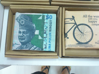
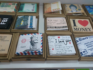
Money put in money, it's quite common and i know it...but i still like their spirit to remain the creativity into all of the item they sell. Another thing that i appreciate is their shop name, Material...Too bad i didn't capture it down, but it's gave me a nice and special outlook...more like a recycle shop, and it definitely is.

Such a long time never have a walk in a shopping centre...and i realize i'm kinda...outdated, seriously. I don't know what had changed outside...