Wednesday, 24 October 2012

I had brought art into my daily life

Sometime i did something crazy,
while people are watching TV,
I don't watch,
but I look at their face,
take some angle,
and see what's the differences,
and how they shows their emotion while concentrating on something else.

Sometime I even stare at my friend while he/she talking to me,
or people are talking around me,
I don't know what happen, 
my eyes will automatically go and see those details on everywhere,
my brain will concentrate on what my eyes seen.

However, I got no choice to do so,
since I am working out on a human character,
even a monster character,
about environment,
to be honest,
I can't find any good place in our country.
Due to our country having a badly haze,
and we lack of genius...
(As if our country have a lot, probably all have gone to overseas)

Even me, I would still prefer to further my career oversea,
if it's possible...
I wish to be a famous designer or animator...
Hopefully my hardworking can tell the true ability that I had gained.


What i had learned in Creative Studio 2

Creative Studio 2, 
base on the classes I had been attended. 
I could honestly tell that...
this subject is quite helpful to my final.
From a very lost,
to a very clear minded.
Obviously, I learned to plan my schedule wisely,
do things more efficiency.

In the meanwhile,
I choose to study about human facial expression,
the reason why i choose this title
is because I love to study about human more,
I hope to knowledge more about how human functions,
Since I'm born in this world,
I had started to ask a lots of things about human,
why we're alive,
why we can walk, talk, play and so on...
however, these are more in scientific path,
so in the other way,
I use a designer path to get more understanding about
human.
Facial Expression is the best choice
for me to study about,
how does a human shows the emotions,
how human communicate,
what if human got no facial expression,
& etc...


Monday, 20 August 2012

10Q & a visual art

First and foremost, Lecturer had asked us to be in group of 2 person. Then, we have to think of 10question toward opponent, the question must be relating to him/her. Well, I'm in a group with Jiun Hao. I had asked him 10questions, which is :-

What kind of accessories you would like to wear it on everyday? beg
What's the color you like the most? black
What is your height? 175cm
What do you like to do when you feel free? watch movie on television
What is your favourite food? Brinjal
What's the thing you hate the most? ginger
What pet do you like to adopt? dog
How do you looks like when you just awake? Hair will never become messy
Which country you like the most? Japan
Why you like japan instead of other country? Japanese girl pretty

After having the answers...we need to use at least 5 of the question to combine and make a visual to present it well. Like what i had done below. With all the answer, i created a brinjal guy with a TV head and a flag on the signal line and a height of 175cm. 


Well, This is really a very creative game to play. Can train up our mind with full of creative and ideas. To enhance our things from separately items into one item but meaningful.

Monday, 6 August 2012

Interior design (final short film)

In this post, I would like to share my researches since I started to do my final short film designs and concepts. I feel so tough when the idea are not good enough...because there's too much idea been used by those artist or designers outside...so I would just try to search their designs and try to brainstorm my own original idea...

In my story, the character who called, Ski...she is a western girl. She has a normal life as what a teenager does. She don't really clean her room much, a little messy. However, she got a very different personality compare with normal girl. She is very steady and serious person, not easy to get shocked even how scary it is. She has a magic power, element in ice. She is now in the winter time.

From this image, i try to use the compositing and arrangement...seems suitable for my character. (ignore the color)

From this image, i think of using the bed keeping under the stage...seems special

Messy room 01

Messy room 02

This is the design in my 3D modelling. 01

This is the design in my 3D modelling. 02

This is the design in my 3D modelling. 03


Furnitures
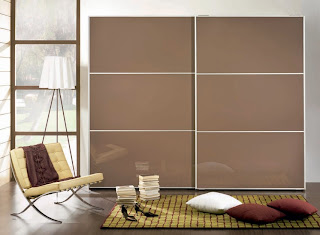
Cupboard design 01

Cupboard design 02

beanbag chair design

Clothes cupboard 01

Clothes cupboard 02

Clothes cupboard 03

wall shelves

window design


This is what i research, there's more images and information...yet i can't label so much right here.
However these are the important part that I would like to share. Will have more to post. After gather all the furnitures, i will combine all together and analyse which are the things that able and unable to fit in.
So overall will be better and not weird looking.

Saturday, 28 July 2012

Poem

    Yesterday, creative studio class. I never thought of doing a poem. Surprisingly, It's been a long time I never play on poem, but I did create a lots of poem when I was in secondary school life. Anyway, that's a random and bad poem as well. Just to create to express my feeling. Well, yesterday, I did created a random poem again. To present my poem, title of "The cat & woman".

A cat walks like a devil,
        A woman dress like an angel.

Cat walks under the moonlight,
        Yet woman dress under a tungsten light.

The cat hide in a sheltered tree,
        The woman stay at a tremendous tree.

The cat will play,
        While woman's away.

*modified

     To present human, no matter how bad personality. They still having a fine heart. We don't deserve to be a bad person, just the situation,side effect or surrounding necessarily makes us appear our bad heart.
     The reason why I present the human on top of the tree instead of the cat under the tree, is because human normally don't shows their good heart, even though they wanted so much. However, jealousy and unfair make us not to talk about good, but all about people's bad rumours.

*black cat present the bad heart

Monday, 16 July 2012

Novelty? Invention? Innovation?

First and foremost, Novelty, which in the meaning of new and unusual. In the noun of Novelty has 4 senses which is originality by virtue of being refreshingly novel, new and surprising. Yet, a small inexpensive mass-produced article and cheap showy jewelry or ornament on clothing.


Novelty? The relationship with design is more like a brand new quality. A product which never or have not produce in the earth yet. Produce a Novelty item, is to make the market and industry become better and different from generation to generation. The technology is being too fast is because the human being are using the way of Novelty designs and make things as small as possible but as fast as lightning, such as a thumbdrive, chips and more...Novelty do makes more and more amusing design for the architecture. It's a concept to upgrade everything to be more unique.


Invention? An invention is a unique or novel device, method, composition or process. It may also be an improvement upon a machine or product, or alternate means of achieving a process. An invention that is not derived from an existing model or idea, or that achieves a completely unique function or result, may be a radical breakthrough. Such a work is novel and not obvious to others skilled in the same field. Invention  in the Arts, Invention has a long and important history. Inventive thinking has always played a creativity path. While some inventions in the arts are patentable, others are not because they cannot fulfill the strict requirements governments has established for granting them.

Innovation? Innovation is the creation of better or more effective products, processes, services, technologies or ideas that are readily available to markets, governments, and society. Innovation differs from invention in that innovation refers to the use of better and as a result, novel idea or method, whereas invention refers more directly to the creation of the idea or method itself. Innovation differs from improvement in that innovation refers to the notion of doing something different rather than doing the same thing better. 

Novelty, Invention and innovation are playing a very priority role to the creation of better products, processes, services, technologies or ideas. The stage of Novelty to Invention is to process a product from nothing to something which human needs, while Inventing a product, creativities do make things way better and giving out a special and amusing visual and entertain humans. After an invention, Innovation comes in to make a confirmation to be into the market, so human can enjoy the creation products with full of satisfaction.


Wednesday, 11 July 2012

Final Semester

Well, time gone too fast...I'm now right on the final year semester...It's makes me full of pressure and brainstorming since the previous semester. What do i think i can do, references and sketches...to brainstorm myself. I did some research on character from disney and dreamworks. Why i do research on it is because that kind of character probably i still can afford instead of doing a hyper-realistic characters.
However, I found some references to study, Dreamwork which inspired me a lot...

The posing and the facial expressions.

A character sketch should make it in different poses to get knowledge more about what to do in animation.

I'm studying the body shapes and do consider to create thin and long legs. So this reference is to study the curving on the legs and body.

A little animating poses from google image.


http://petshopboxstudio.com/blog/articles/gallery-of-disney-character-design-sketches/
This link is so freaking amazing...all about dreamworks characters...the way they do the rough sketches, colors editing, posing and etc...

http://sketchtopia.wordpress.com/tag/dreamworks/
This is all about the modelling of the characters in dreamworks.

http://artofnicomarlet.tumblr.com/
The color they used to sketch is in monocromatic, and they play with the same type of the characteristic which is very obvious.

http://www.drawinghowtodraw.com/stepbystepdrawinglessons/2012/01/how-to-draw-rapunzel-from-tangled-with-easy-step-by-step-drawing-tutorial/
woah~ tutorial to learn how to draw the rapunzel, the main character from tangled.

Saturday, 28 April 2012

Color sense

Base on the topic, color sense. I found some information from the websites. There's a person in forum...He taught me something.
"Color sense comes with experience. Coloring an image consists of three parts: base color, shading and material effects. For the beginning you need not bother about material effects, those are tricks mostly anyway.

Base coloring gives a flavor to the image. Styles vary from grey-scale to the typical asian color shock. I personaly favor colors that surround a certain central color-scheme.

Shading is somewhat more tricky for it adds the depth component to your images. For the beginning i would advice always using a fixed light source (i.e. parallel light from the upper left), so you can focus on getting the shades right, rather than having to worry about light positioning.
I've done images with many light sources and other than additional difficulties for the artist it doesn't appear to add to the overall impression of the image.
Since you're into manga i would suggest using three color shading. That is one color for the parts facing the light, one facing away and one for everything else. Or you can try smooth shading with many different darkness levels.
To learn this i would suggest grabbing a very soft pencil (2b or softer) and start drawing shades in grey scale. Whatever you learn here you can use for colored images as well.
Once you're halfway secure in this you could try to shade the drawings you already uploaded. You may find that even the worst drawing looks several times better with a proper shading.

I hope this was halfway useful. I started off where you are now and i am certain that you will figure in time. Just never give up and observe what other artists do. Learn from their masterpieces and their mistakes."


I did this color wheel and it's was a tough practise ever for me...The color is so hard to combine until what you really wanted...however, I learned something from what the forum's guy mentioned.

Thursday, 8 March 2012

Juxtaposition

Definition: Simply stated, juxtaposition means placing things side-by-side. In art this usually is done with the intention of bringing out a specific quality or creating an effect, particularly when two contrasting or opposing elements are used. The viewer's attention is drawn to the similarities or differences between the elements.
While juxtaposition can be used in terms of formal elements - for example, the use of aggressive mark-making in contrast to an area of very controlled shading, or an area of crisp detail against something softly handled, it more often refers to concepts or imagery. An artist might juxtapose a machine-made object or urban environment against organic elements of nature, in order to highlight different qualities in the two. Note that the way this is done can dramatically change the meaning: we might regard the machine-made or human-created as representing safety and order against the uncontrollable strength of nature; or we might see the fragility and beauty of nature against the soul-less uniformity of the urban world, depending on the nature of the subjects or images and the way they are presented.
 In literature and film, Juxtaposition is the arrangement of two opposing ideas, characters, objects, etc. side-by-side or in similar narratives for effect. Lost often uses juxtaposition to further develop the storyline or characters - it is applied variously to opposing emotions, abstract concepts, character traits/ values, or images.
Juxtaposition arts~
Is a youth oriented non-profit visual art center in Minneapolis, Minnesota known for community collaborations, studio classes and workshops, public mural programs and art exhibition. Founded in 1995, the organization's mission is to empower youth and community to use the arts to actualize their full potential.

Thursday, 1 March 2012

Lynas

Lynas Corporation, Ltd. is an Australian rare earths mining company, listed on the Australian Securities Exchange as a S&P/ASX 200 company. It has two major operations : A mining and concentration plant at Mount Weld, Western Australia, and a refining facility now under construction at Kuantan, Malaysia.


Kuantan, Malaysia

The LAMP at Kuantan is being built with support from the Malaysian government, with 'pioneer' status including a 12-year tax exemption. The ore processing will annually yield several thousand tonnes of waste product (Gypsum - A very soft sulfate mineral) which contains high concentration of thorium, a radioactive element. Concerns regarding the short and long term storage of this waste material, politicised in the context of forthcoming parliamentary elections, fueled widespread protests in Malaysia in 2011. According to a New York Times report whistle blower engineers claimed that short cuts were taken on the construction of the LAMP including the use of cheaper standard steel instead of the more expensive materials to deal with the slightly radioactive, super heated and highly corrosive slurry used in the plant.

THIS IS WHAT THE LYNAS CORPORATION, LTD says...
Lynas Corporation strives for excellence in safety and health. We are committed to providing and maintaining a safe work environment and preventing injury, illness and impairment to the health of our employees, business partners and the community. 


But do you think it's really safe? How IF someday after built, it accidentally get error? How IF someday the corrosive accidentally flows to the river? and the radioactive flows to the cloud and rain in our city?

I'm seriously disagree with this project!! ANTI-LYNAS...Save Malaysia and fuck the lynas yeah~

Wednesday, 22 February 2012

The architecture's design

Half Dose : BIGNYC
 For the fourth year in a row the Times Square Alliance has commissioned an architect to create a heart in Times Square just in time for Valentine's Day. This year's installation is by Bjarke Ingels Group(BIG) with FLATCUT_and Local Projects and it is appropriately titled BIG NYC. As the placard next to it, visible in the photo above, describes it:

More people = more love. A BIG red heart pulses with glowing light in a grove of glass rods. A
single person can activate the beating heart, but joining hands with others will make the heart
beat even faster to create a brightly burning heart.


These 400 acrylic tubes -- a 20 by 20 grid -- create a 10-foot-tall cube that recedes or holds its own in the Times Square environ. The installation alters between these impressions depending on the glow of the LEDs in the center of the cube: Between "beats" the tubes almost disappear, but when glowing the heart shape is well-defined and it pulls one towards it. The above view is from a block sourth of Father Duffy Square, where the heart resides just south of the TKTS booth and steps.
 The photos above and below are taken from the TKTS steps. These views are particularly interesting because they give a slight glimpse of the tops of the 400 tubes. Also, from the steps the immediate background for the heart is the crowd of people passing around it.
Just south of the installation is its interactive component, called out simply with a heart on a podium, the words "touch me," and some visual directions on how to make the installation beat faster. Upon touching the pad, the LEDs glow in a pulsating rhythm that speeds up when people hold hands or, supposedly, when they kiss. It's a neat idea, to link the intimacy of Valentine's Day with the impersonal crowdedness of Times Square and New York City. This occurs not only in the interactive part, but also in the way the heart -- physically something that each individual has -- is figuratively created by the density of rods.
.
While the three previous installations created hearts from matter -- metal, ice, fabric -- this one opts for immaterial light and the convergence of the color red in a mass of otherwise undifferentiated clear rods. In name BIG♥NYC may be as much promo for Mr. Ingels as it is a Valentine's display for New York City, but its qualities are undeniable and it is a welcome addition to the Times Square for its brief duration (until the end of the month).

Saturday, 11 February 2012

Typography

Oh yeah, I found out something interesting as what i had mentioned last blog...haha.
It's a fun topic and i quite interested on, I found a web that giving me a very nice sentence, which is
http://www.wpdfd.com/issues/23/typography/

"Good typography is just as important on a Web page as it is in any other medium. The fact that it appears on a computer screen and not on a piece of paper is immaterial; it should still be pleasing to look at and easy to read."

From here, i started to do some more research about typo, and it's not tat simple to make someone feel comfortable with the color sense and the composition. Every tiny mistaken will given a big outlook to the audience. Although most of the audience didn't know about typography at all, but they can still having a sense to conclude it's nice or bad...

Other than composition, emphasis, de-emphasis, relativity and type, size, weight and many more are very priority to make a perfect typography.

I had a typography class in semester 1, and I learned many thing in there. before i learned, I would like to play sometime very 'decorative' which many people thought it's nice! Conclusion, it's totally not what a typography. And I changed to be making something simple and perfect.(still in beginner process only, hehe)

However, A complicated background of any poster or whatever design, there must be a simple font for it, or else no focus point and very dirty outlook for the overall. No one will realize it. For decorative font is using when the background is quite empty and simple. haha...

I guess this is something i learned, and there might be more about it.

Monday, 6 February 2012

Creatives Logos

These days, i started to get more interest on playing logos, I know logos is something pretty hard to get the concept and idea...One of my senior who studying in graphic design, he told me logos is the toughest to make the better one...Simple and perfect. This 2 words is easy if separate them, but when they are combining together when we going to do both into a graphic. That's totally insane...

I had found something nice and cool...I wonder how they get those ideas and i just love it. I wish i could able to create some logos for any company. That will be a very precious moment after work done.

here's some links i found.
http://www.graphicdesignblog.org/logo-design-ideas/
http://justcreativedesign.com/2012/02/01/the-2011-logo-of-the-year/

From the first link :
I found out they are very outstanding, for sure.
And I get knowledge about different type of logo for different company, such as business, target audience, always brainstorm, thinking an alluring tagline...etc...
It's very cool~! I more interested on business's logo type anyway...

From the second link :
I don't think i could make that, haha...It's freaking awesome...
The toughest thing for me is the colors, I'm weak on it, because I don't have any base before i joined dasein, I'm totally nothing for arts...and these, 'FORK & KNIFE' and 'Bread & Breakfast' have makes me feel soft and peaceful color. such as a grassy green with a darker green instead of dirty colors, but i more admire on the "bread & breakfast' it's using a very soft and tough color to combine together, it's very hard to make it, I do tried before...

Beside that, I'm also quite interested on Typography style.
For audience, they might say, It's freaking easy, just put the words~!
No, It's totally a wrong thinking. Typography which i had studied last 2 semester. and i learned something much on it. It's very strict, can't even have any mistakes inside, or else that's an epic fail typography...
Next post going to have some typos stuff...^^

Something I found

Oh, A day outing, having some creative stuff to show off...
I had gone to 1Utama(Jusco), where i found a shop, Material...
It surprised me and lured me in. Why I said so? haha, just take a look, unfortunate I never capture much items which sell there...
  A camera lens outlook, but actually just a cup bottle. looks real~
  A beg with a camera, it's so real~! Never thought it's real if just simply a look.


Money put in money, it's quite common and i know it...but i still like their spirit to remain the creativity into all of the item they sell. Another thing that i appreciate is their shop name, Material...Too bad i didn't capture it down, but it's gave me a nice and special outlook...more like a recycle shop, and it definitely is.

Such a long time never have a walk in a shopping centre...and i realize i'm kinda...outdated, seriously. I don't know what had changed outside...

Wednesday, 11 January 2012

The mid of a week

Oh, time goes too fast...and I seems like still in lazy mood...Gosh~ Can't be that lazy anymore!! =3=...Going to force myself to do something more already...If not my grade will always remaining...

A challenging lesson today we had...A new lecturer is teaching us, and I feel quite lucky to have a proffesional lecturer guiding me this semester...I wish I could able to learn further more which out of my expectation~! Anyway, we call him as 'hoyi' as he name it to us...I start to get warming up after I heard what he had told us...3D is not a simple works, which can get lots of pay in future..."Advanced it and no worries about no client comes for you..." Perhaps, his attitude had changed my mind from being a concept artist to an animator...I wish to be last time...just that, I'm afraid of the challenge and salary is not that good as in my expectation, but then now only i recognize the real pay for an animator!! it's awesome~ XD...

I gonna fight the challenge until the point that i can afford...Anyway, I'm trying to search for Hatsunemiku information soon...hope i could find something better...^^